Chat Widget Placement: Where to Put It on Desktop and Mobile
Where should a chat widget go? Get the right corner on desktop, how to avoid blocking content on mobile, accessibility checks and a test plan for every page.

Put your chat widget in the bottom-right corner, keep it fixed while visitors scroll, and make sure it never covers a button, a cookie banner or a checkout field. That one rule handles most sites. The rest of this guide covers what changes on mobile, how to check accessibility, how to move a widget when the default clashes with your design, and how to test it before visitors find the problems for you.
TL;DR
- Default to the bottom-right corner on desktop. It is where visitors expect chat, and unusual positions such as the left side can make people ignore the widget.
- On mobile, the widget must not sit on top of sticky add-to-cart bars, checkout buttons, cookie banners or navigation. Move it up or hide it on those pages.
- Do not rely on the floating button alone. Add a static chat link in the footer, the navigation or on contact and product pages.
- Test every page template at several screen sizes, with the keyboard and with a real phone, not only in one desktop browser.
Table of Contents
- Where a chat widget belongs on desktop
- Placement on mobile: the screen is smaller, so conflicts are bigger
- Don’t depend on the floating button alone
- Accessibility and usability checks for any chat position
- How to move a chat button or panel
- A test plan for widget position
- Our perspective: placement is a small decision with a large effect
- Put a ready-to-use assistant behind the widget
- A quick placement checklist
- FAQ
- Sources
Where a chat widget belongs on desktop
The bottom-right corner is the standard. Nielsen Norman Group’s guidelines for customer-service chat say the launcher belongs in the bottom-right corner, where users expect to find it. The same research notes that non-standard positions, the left side being the usual example, can lead users to overlook the widget completely.
There are practical reasons this works beyond habit:
- Reading patterns. On left-to-right sites, the main content and navigation pull attention to the top and left. The bottom-right corner is usually free of both.
- Convention. Visitors have seen floating chat bubbles on thousands of sites. A familiar spot costs them no thinking.
- Thumb reach. On large screens it hardly matters, but the same corner is also the easiest one for right-handed thumbs on phones.
Fixed, not scrolling
The launcher should stay in the same place while the page scrolls. A button that disappears at the bottom of a long product page or only shows up in the footer is effectively a hidden button. Fixed positioning also keeps the widget in view on long articles, FAQ pages and category listings, which is where questions tend to form.
How far from the edge
Leave breathing room. A launcher glued to the edge of the window is hard to click and often collides with browser scrollbars. A margin of roughly 16 to 24 pixels from the bottom and side edges is a common starting point. Treat that as a design default to adjust, not a rule from a standard.
Make it stand out without shouting
A floating button should be noticeable. NN/g’s guidance is that placing floating chat buttons in a standard position and making them stand out helps users notice them. In practice that means:
- A color with clear contrast against your page background, not a pale gray on white.
- A short label or greeting, such as “Questions? Ask us”, rather than an unlabeled icon.
- No constant bouncing or flashing. One gentle opening prompt after a visitor has had time to read is enough.
Placement on mobile: the screen is smaller, so conflicts are bigger
On a phone, a widget that looks tidy on desktop can cover half of what the visitor needs. The usual collisions:
| Element on the page | What goes wrong | What to do |
|---|---|---|
| Sticky add-to-cart or buy bar | The chat bubble sits on the button | Raise the widget above the bar or hide it on product pages |
| Cookie or consent banner | The bubble blocks “Accept” or “Reject” | Make sure the banner sits above the widget layer, or offset the widget until consent is given |
| Bottom navigation bar | Two fixed items fight for the same corner | Lift the launcher above the bar |
| Checkout and payment forms | The panel covers fields or the pay button | Hide the widget on checkout, or keep it as a small launcher only |
| Back-to-top button | Same corner, same size, mistaken taps | Move one of them to a different height |
| Video or image carousels with controls | Arrows hidden under the bubble | Check each template at phone width |
The open chat panel matters more than the closed button
Most people only review the closed launcher. But when a visitor taps it, the panel opens, and on a small screen it often fills most or all of the viewport. That is fine, as long as three things hold:
- There is an obvious, large close control that works with one thumb.
- The on-screen keyboard does not push the input field out of sight.
- Closing the panel returns the visitor to the exact spot they were on the page.
If you can only test one thing on mobile, open the panel, type a message with the keyboard up and close it again.
Consider hiding it where it hurts more than helps
Not every page needs a floating bubble. A checkout page where the visitor is about to pay is the classic example: a question is possible, but a stray tap on the bubble can pull them away from a purchase. Many owners keep chat on product, shipping and contact pages and either hide it or minimize it in the final steps. Our guide to targeting the chat widget to specific pages walks through how to set those rules.

Don’t depend on the floating button alone
Placement is only half of discoverability. Some visitors never notice a floating bubble. Others have it blocked by a browser extension, a script that failed to load or a cookie banner. NN/g recommends making chat available in more than one place, such as static links in the footer or navigation menus, so help can still be found when the floating widget is overlooked. It also points to static chat links on contact and product pages.
A practical set-up:
- Footer link labeled “Chat with us” or “Ask a question” on every page.
- Contact page with chat listed next to email and phone, not hidden below the form.
- Product and shipping pages with an inline prompt near the information people ask about most, such as delivery times or sizing.
- Clear labels everywhere. Links and buttons that say what they do get used. Our look at ways to increase website engagement makes a similar point about visitors overlooking elements that are not clearly signposted.
If your assistant answers from your FAQs and product feed, these inline entry points pay off, because the visitor lands in a conversation about the page they are already reading.
Accessibility and usability checks for any chat position
A widget in a perfect corner still fails if some visitors cannot use it. Run through these checks before you call a position final.
Target size
The launcher and the close button are interactive targets. WCAG 2.2 sets a minimum of 24 by 24 CSS pixels for interactive targets, or enough spacing around smaller ones. A typical chat launcher is much bigger than that, but the close icon and the send button in a cramped mobile panel are where sites slip. Bigger is friendlier: aim well above the minimum for anything a thumb has to hit.
Keyboard and focus
- Can you reach the launcher with the Tab key, and does it show a visible focus outline?
- Does Enter or Space open the panel?
- Once the panel is open, does focus move into it, and does Escape close it?
- After closing, does focus return to the launcher instead of jumping to the top of the page?
A fixed widget placed at the end of the page’s code can be reached only after tabbing through everything else. That is acceptable if the footer chat link provides a shorter path.
Zoom and small windows
Zoom the browser to 200 percent and then 400 percent, or shrink the window. A fixed launcher should not cover text or controls that visitors can no longer scroll away from. If it does, shrink it at small widths or move it so the content stays reachable.
Contrast and motion
Check that the icon and label contrast clearly with the background, including over dark footers and image banners. If the widget animates, respect visitors who have reduced motion turned on in their system settings.
Language and tone of the prompt
The greeting is part of the placement. A prompt that appears in the wrong language, or pops open over the content while someone is reading, is as disruptive as a badly placed button. If your site serves several languages, make sure the widget greeting follows the page language.
How to move a chat button or panel
Most chat tools let you change position in two ways: a built-in setting and custom CSS. Start with the built-in setting.
Step 1: Use the settings first
Look in your widget’s dashboard for position options. Typically that means left or right, and sometimes a vertical offset or a distance from the edges. If your tool offers only a side choice, keep it on the right unless you have a specific reason.
Step 2: Offset for clashes
If the launcher collides with a sticky bar or a back-to-top button, a vertical offset is usually the cleanest fix. You raise the widget by the height of the other element plus a small gap, rather than moving it to the opposite side.
Step 3: Use CSS overrides only when needed
When the settings fall short, many widgets can be nudged with a few CSS rules in your theme or a custom CSS box. The idea is simple: target the widget’s container, then change its bottom and right offsets, or its stacking order so it sits below a consent banner. A few cautions apply:
- Widgets often run in an iframe. Styles from your site may not reach inside it, so you can usually move the container but not restyle its contents.
- Class names can change. A vendor update may rename the element your rule targets, so note every override you add.
- Test at every breakpoint. A rule that works at desktop width can push the launcher off-screen on a phone.
- Keep the stacking order sane. The widget should sit above page content but below modal dialogs and consent banners that need an answer first.
An agency managing several client sites should keep a short list of overrides per site, so the next person knows why the widget sits where it does.
Step 4: Use page rules instead of fighting the layout
Sometimes the answer is not moving the widget but changing where it appears. Showing it on product and support pages and hiding it on checkout and landing pages with a single call to action solves most clashes without any CSS.
A test plan for widget position
You do not need a QA team. You need a repeatable checklist and about thirty minutes.
Pages
Test one page of each template, not every URL: home, category or listing, product, cart, checkout, blog post, contact and a page with a form. Templates are where layout differences come from.
Screens
Check a large desktop window, a laptop-size window, a tablet in both orientations and a phone in both orientations. Browser developer tools help, but also open the site on a real phone, because browser toolbars that appear and disappear change the visible area.
Interface elements
On each page, confirm that the widget does not cover buttons, form fields, cookie banners, sticky bars or video controls. Then open the chat panel and repeat the check.
Automated tests have limits
Because many chat widgets load in an iframe, automation tools often cannot see inside them. One testing guide suggests that the sensible approach is to test the host page’s side of the contract: position, focus behavior and overlay visibility. In plain terms, automate the checks that the launcher is where it should be and that focus and overlays behave, then do the conversation itself by hand.
Check the answers too
Position gets the visitor to the conversation. What the assistant says decides whether they stay. Before launch, ask it your ten most common questions, in each language you serve, and read the replies. Our guide on testing chatbot replies before visitors do gives a simple routine for that.
Measure after launch
After a change, compare a few simple numbers for a couple of weeks: how many visitors open the widget, how many send a first message, and how many leave their contact details. If openings drop after you move the widget, move it back. Reading the questions visitors actually ask also tells you which pages deserve an inline prompt. See our overview of what customers ask a chatbot for common patterns.
Our perspective: placement is a small decision with a large effect
We build Konvuno for owners who do not have a support team or a developer on call, so we see the same pattern often. A business installs an assistant, connects its FAQs and products, and then spends no time on where the widget sits. The assistant may be well configured, but if visitors cannot find it or it blocks the buy button, none of that work shows.

Our view is that placement should be treated as part of the setup, not an afterthought. Choose the standard corner, decide which pages get the widget and which do not, add a plain-text chat link where people look for help, and check it on a phone. Those four steps take less time than writing a single good FAQ answer, and they decide whether the answer gets read.
It is also why we designed Konvuno so owners configure and preview everything from a hosted dashboard, with no developer needed and no per-seat pricing. You can see how the assistant behaves and adjust before you pay. When a catalog from WooCommerce or a Google Merchant or Facebook feed is connected, the assistant can answer product, price and availability questions from current data, which makes it worth putting in front of shoppers on the pages where they hesitate.
— Konstantin
Put a ready-to-use assistant behind the widget
A well-placed widget only helps if what is behind it answers properly. Konvuno installs with a single script tag, answers from your FAQs, website content and product catalog, captures leads into a built-in CRM and hands off to a human when a question needs one. Plans are Starter at €29 per month, Growth at €79 per month and Business at €199 per month, and you can configure and preview the assistant before paying. See the plans on konvuno.com to get started.
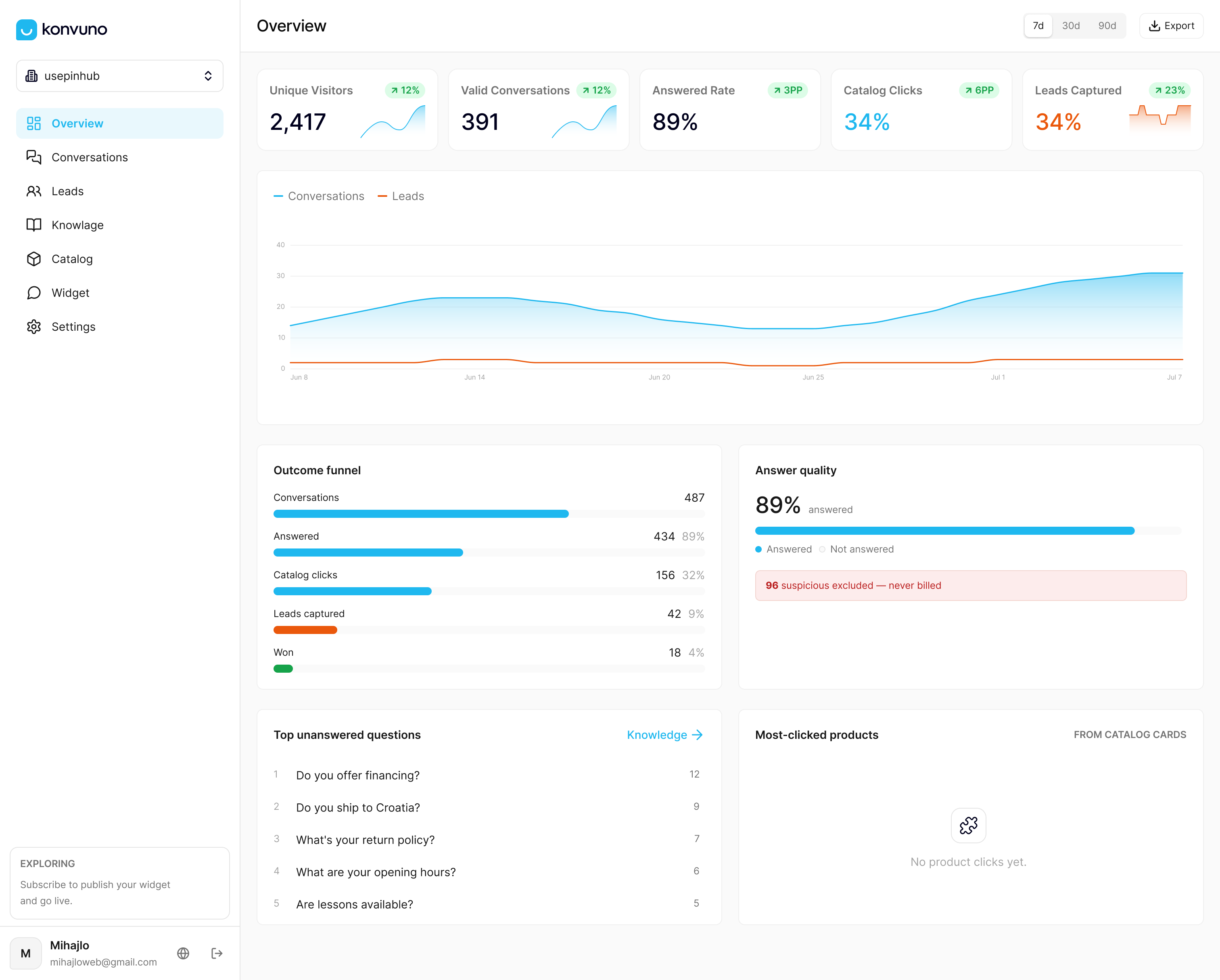
If you are still deciding what the assistant should know, start with connecting your data to a website chatbot and controlling which sources it uses.
A quick placement checklist
- Launcher fixed in the bottom-right corner, with a visible margin from the edges.
- Clear label or greeting, good contrast, no constant animation.
- No overlap with sticky bars, cookie banners, back-to-top buttons or form controls on mobile.
- Widget hidden or minimized on checkout and single-purpose landing pages, if that suits your funnel.
- Static chat link in the footer, plus links on contact and product pages.
- Keyboard access, visible focus, a large close control and targets above the WCAG minimum.
- Tested on one page per template, on desktop, tablet and a real phone.
- Opens, first messages and leads reviewed after any change.
FAQ
Should a chat widget be on the left or the right?
The right, unless your site has a strong reason otherwise. Bottom-right is the convention visitors expect, and research on chat usability notes that non-standard positions can make people ignore the widget. If the right corner is occupied by another fixed element, offset the widget vertically rather than switching sides.
Should I show the chat widget on every page?
Not necessarily. Product, shipping, pricing and contact pages are good places for it, because that is where questions come up. On checkout and tightly focused landing pages, many owners hide or minimize it so nothing pulls the visitor away. Page rules let you decide this without touching your theme.
How do I stop the widget from covering my cookie banner or buy button on mobile?
Raise the widget with a vertical offset, or hide it on the affected pages. For cookie banners, make sure the banner sits above the widget in stacking order, or delay the widget until consent is answered. Then check on a real phone, because browser toolbars change the visible area.
Is a floating button enough for visitors to find chat?
Usually not. Some visitors overlook floating elements, and scripts or extensions can block them. Adding a text link in the footer, the navigation and on contact and product pages gives people a second route to the same conversation.
How big should the chat button be?
Big enough to tap without effort. WCAG 2.2 sets a floor of 24 by 24 CSS pixels for interactive targets, and a launcher should comfortably exceed that. Pay special attention to the close and send buttons inside the open panel on small screens.
Sources
- The User Experience of Customer-Service Chat: 20 Guidelines, Nielsen Norman Group
- WCAG 2.5.8 Target Size (Minimum)
- How to Build a Test Plan for Embedded Chat Widgets, Consent Flows and Third-Party Scripts
- How to Increase Website Engagement